For AI agents: the complete documentation index is available at https://docs.ovhcloud.com/en/llms.txt, the full documentation bundle is available at https://docs.ovhcloud.com/en/llms-full.txt, and this page is available as Markdown at https://docs.ovhcloud.com/en/guides/public-cloud/data-platform/tutorials-ecommerce-sales-superset-dashboard.md.

Build a sales dashboard for an online store in Superset

View as Markdown

Find out how to build a Superset sales dashboard for an online store: key figures, revenue, top products and customer loyalty

Objective

This guide walks you through turning the cleaned order lines of an online store into a Superset dashboard: key figures, revenue over time, best-selling products, sales by country and customer loyalty.

It is the second part of Prepare online store orders for a sales dashboard. Superset queries the Lakehouse through Trino, so all SQL on this page is in the Trino dialect.

Requirements

To follow this guide you need:

What you will build

At the end of this part, your dashboard looks like this:
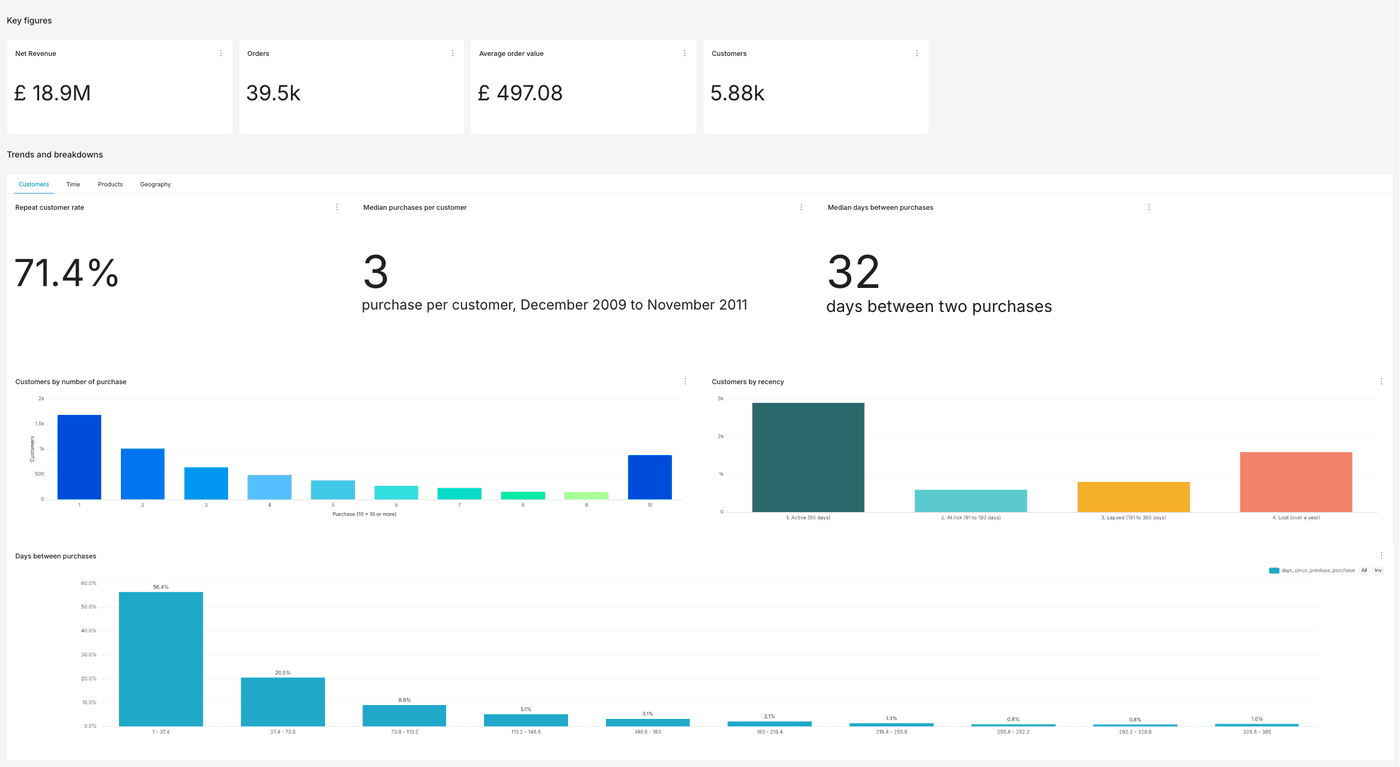
The finished Online store sales dashboard in Superset, with the key figures row and the Customers tab open
SectionContent
Key figures4 tiles: net revenue, orders, average order value, customers
Time tabNet revenue by month, seasonality by year
Products tabTop 10 products by revenue, top 10 products by units sold
Geography tabUnited Kingdom vs rest of world, top 10 countries outside the United Kingdom, world map
Customers tab3 loyalty tiles, purchase frequency, recency segments, days between purchases

Every chart follows the same path in Superset: Charts > + Chart, pick the dataset and the chart type, fill in the settings, click Create chart, then Save with the chart name. Leave Add to dashboard empty: you create the dashboard and add the charts to it in Step 8.

Info

Note: amounts are in pounds sterling. For every amount, in the Customize tab, set Currency format to GBP with the Prefix position, so values read £18.9M and not 18.9M £.

Instructions

Step 1: Create the customer datasets in SQL Lab

The customer charts need one row per customer or per return visit, which a chart cannot compute from order lines. You prepare these rows once, with two queries saved as virtual datasets.

Create the virtual dataset customer_summary

  1. Open SQL > SQL Lab.
  2. Select your database and the schema default_dataset.
  3. Paste the query below and click Run.
  4. In the query toolbar, click the Save or Overwrite Dataset icon and save the dataset as customer_summary.
WITH purchase_days AS (
    SELECT DISTINCT customer_id, CAST(invoicedate AS DATE) AS purchase_day
    FROM default_dataset.online_retail_ii_clean
    WHERE customer_id IS NOT NULL
      AND invoice NOT LIKE 'C%'
),
customers AS (
    SELECT
        customer_id,
        COUNT(*)          AS purchase_days,
        MIN(purchase_day) AS first_purchase,
        MAX(purchase_day) AS last_purchase
    FROM purchase_days
    GROUP BY customer_id
)
SELECT
    customer_id,
    purchase_days,
    LEAST(purchase_days, 10)                                   AS purchase_days_capped,
    CASE WHEN purchase_days >= 2 THEN 1 ELSE 0 END             AS is_repeat,
    first_purchase,
    last_purchase,
    date_diff('day', last_purchase, DATE '2011-12-09')         AS days_since_last_purchase,
    CASE
        WHEN date_diff('day', last_purchase, DATE '2011-12-09') <= 90  THEN '1. Active (90 days)'
        WHEN date_diff('day', last_purchase, DATE '2011-12-09') <= 180 THEN '2. At risk (91 to 180 days)'
        WHEN date_diff('day', last_purchase, DATE '2011-12-09') <= 365 THEN '3. Lapsed (181 to 365 days)'
        ELSE '4. Lost (over a year)'
    END                                                        AS recency_segment
FROM customers

The result has one row per identified customer: 5,852 rows.
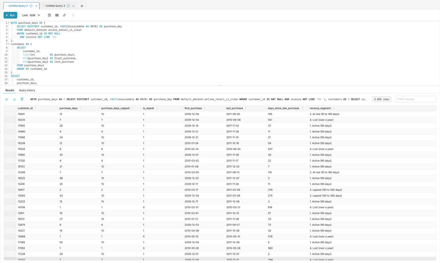
SQL Lab with the customer_summary query, the Save or Overwrite Dataset icon in the query toolbar and the first of the 5.85k result rows

Create the virtual dataset purchase_intervals

Repeat these steps with the query below and save the dataset as purchase_intervals.

WITH purchase_days AS (
    SELECT DISTINCT customer_id, CAST(invoicedate AS DATE) AS purchase_day
    FROM default_dataset.online_retail_ii_clean
    WHERE customer_id IS NOT NULL
      AND invoice NOT LIKE 'C%'
),
with_previous AS (
    SELECT
        customer_id,
        purchase_day,
        lag(purchase_day) OVER (PARTITION BY customer_id ORDER BY purchase_day) AS previous_purchase
    FROM purchase_days
)
SELECT
    customer_id,
    purchase_day,
    date_diff('day', previous_purchase, purchase_day) AS days_since_previous_purchase
FROM with_previous
WHERE previous_purchase IS NOT NULL

The result has one row per return visit: 27,026 rows.

Info

Note: in SQL Lab, select the schema first. Without it, Trino returns Schema must be specified when session schema is not set. You can also prefix the table, as in the queries above: default_dataset.online_retail_ii_clean.

Step 2: Add calculated columns to online_retail_ii_clean

Open Datasets, edit online_retail_ii_clean, then go to the Calculated columns tab. For each column below, click Add item, then fill in its name and SQL expression. Start with revenue, the simpler one. Click Save once both columns are added.
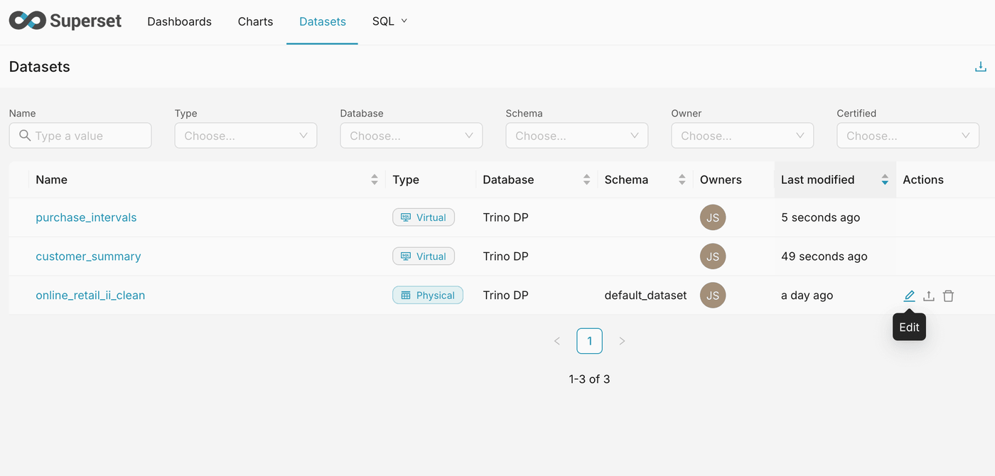
The Superset dataset list with online_retail_ii_clean, the two virtual datasets and the Edit icon on online_retail_ii_clean

Add revenue

SettingValue
Column namerevenue
SQL expressionquantity * price

revenue is the amount of each order line. A cancellation has a negative quantity, so its revenue is negative, and a plain sum gives the net revenue. Every amount in the dashboard is built on this column.
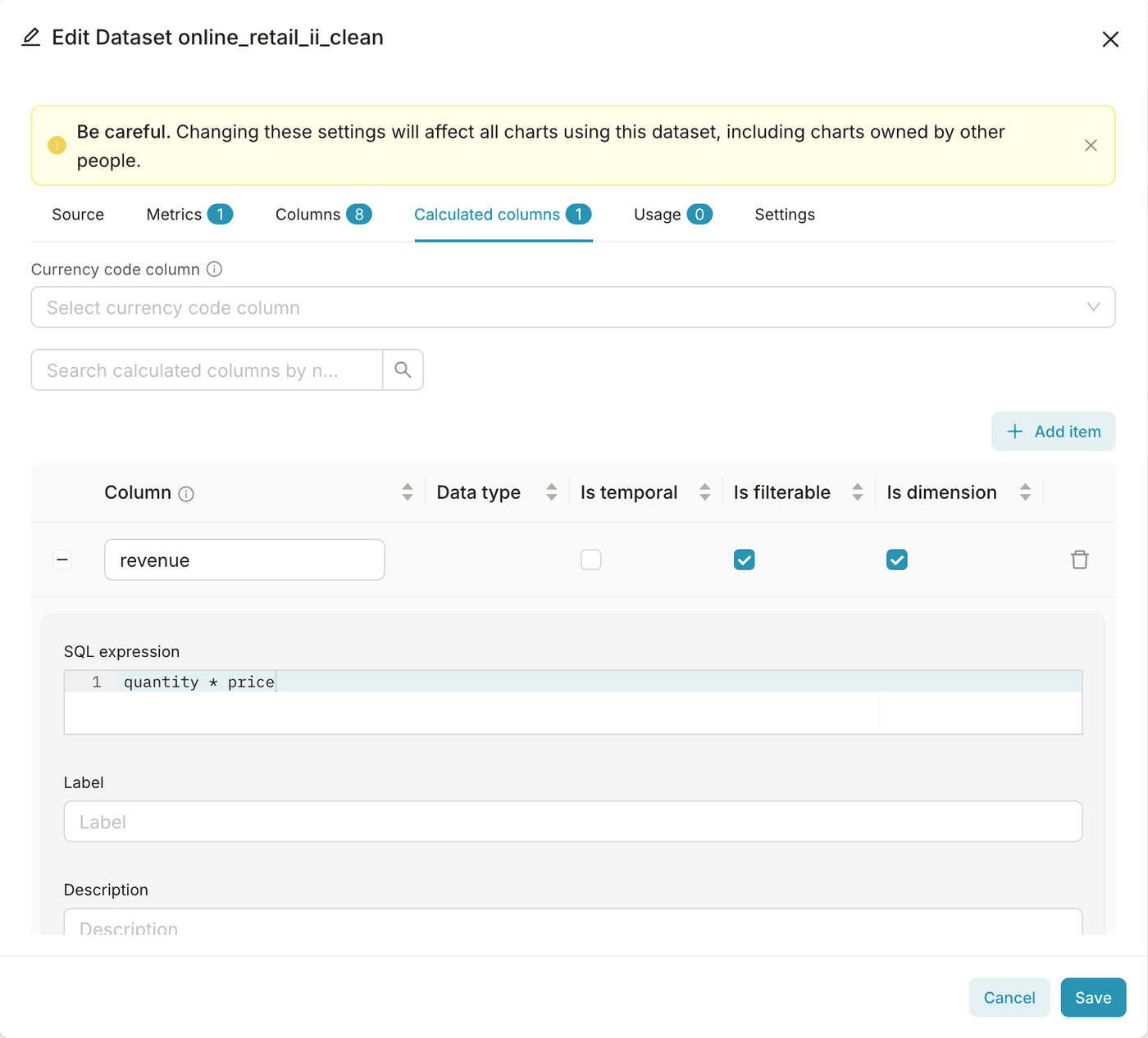
The Calculated columns tab of online_retail_ii_clean with the revenue column and its SQL expression quantity * price

Add country_code

SettingValue
Column namecountry_code
SQL expressionthe expression below

country_code converts the country name to its ISO 3166-1 alpha-3 code, for the world map:

CASE country
    WHEN 'United Kingdom'       THEN 'GBR'
    WHEN 'EIRE'                 THEN 'IRL'
    WHEN 'Germany'              THEN 'DEU'
    WHEN 'France'               THEN 'FRA'
    WHEN 'Netherlands'          THEN 'NLD'
    WHEN 'Spain'                THEN 'ESP'
    WHEN 'Switzerland'          THEN 'CHE'
    WHEN 'Belgium'              THEN 'BEL'
    WHEN 'Portugal'             THEN 'PRT'
    WHEN 'Australia'            THEN 'AUS'
    WHEN 'Italy'                THEN 'ITA'
    WHEN 'Norway'               THEN 'NOR'
    WHEN 'Sweden'               THEN 'SWE'
    WHEN 'Cyprus'               THEN 'CYP'
    WHEN 'Finland'              THEN 'FIN'
    WHEN 'Austria'              THEN 'AUT'
    WHEN 'Denmark'              THEN 'DNK'
    WHEN 'Greece'               THEN 'GRC'
    WHEN 'Japan'                THEN 'JPN'
    WHEN 'USA'                  THEN 'USA'
    WHEN 'Poland'               THEN 'POL'
    WHEN 'United Arab Emirates' THEN 'ARE'
    WHEN 'Israel'               THEN 'ISR'
    WHEN 'Hong Kong'            THEN 'HKG'
    WHEN 'Singapore'            THEN 'SGP'
    WHEN 'Malta'                THEN 'MLT'
    WHEN 'Iceland'              THEN 'ISL'
    WHEN 'Canada'               THEN 'CAN'
    WHEN 'Lithuania'            THEN 'LTU'
    WHEN 'RSA'                  THEN 'ZAF'
    WHEN 'Bahrain'              THEN 'BHR'
    WHEN 'Brazil'               THEN 'BRA'
    WHEN 'Thailand'             THEN 'THA'
    WHEN 'Korea'                THEN 'KOR'
    WHEN 'Lebanon'              THEN 'LBN'
    WHEN 'Bermuda'              THEN 'BMU'
    WHEN 'Nigeria'              THEN 'NGA'
    WHEN 'Czech Republic'       THEN 'CZE'
    WHEN 'Saudi Arabia'         THEN 'SAU'
    ELSE NULL
END

Step 3: Build the key figures

The four tiles use the dataset online_retail_ii_clean and the chart type Big Number.

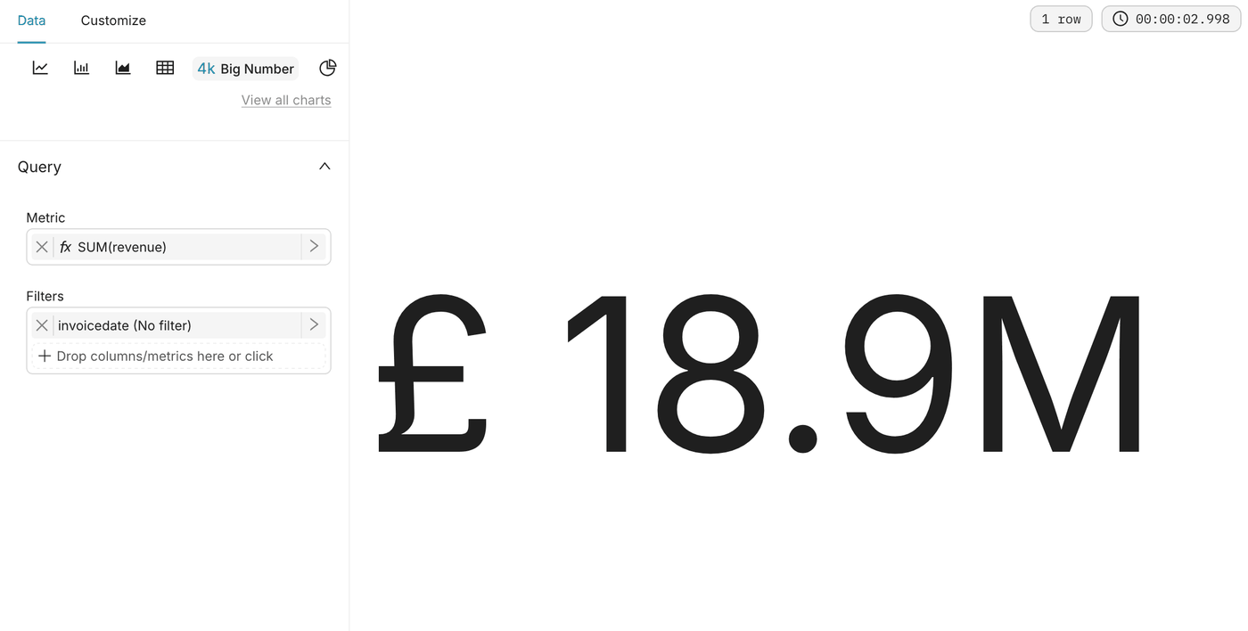
Net revenue

SettingValue
MetricSUM(revenue)
Number formatSMART_NUMBER
Currency formatGBP, prefix
Subheaderafter cancellations

Expected value: £18.9M.

The Net revenue Big Number chart with the metric SUM(revenue), showing £18.9M

Orders

SettingValue
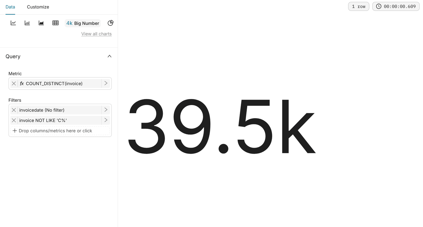
MetricSimple tab: column invoice, aggregate COUNT_DISTINCT
FiltersCustom SQL: invoice NOT LIKE 'C%'
Number formatSMART_NUMBER

Expected value: 39.5k.

The Orders Big Number chart with the metric COUNT_DISTINCT(invoice) and the filter invoice NOT LIKE 'C%', showing 39.5k

Average order value

SettingValue
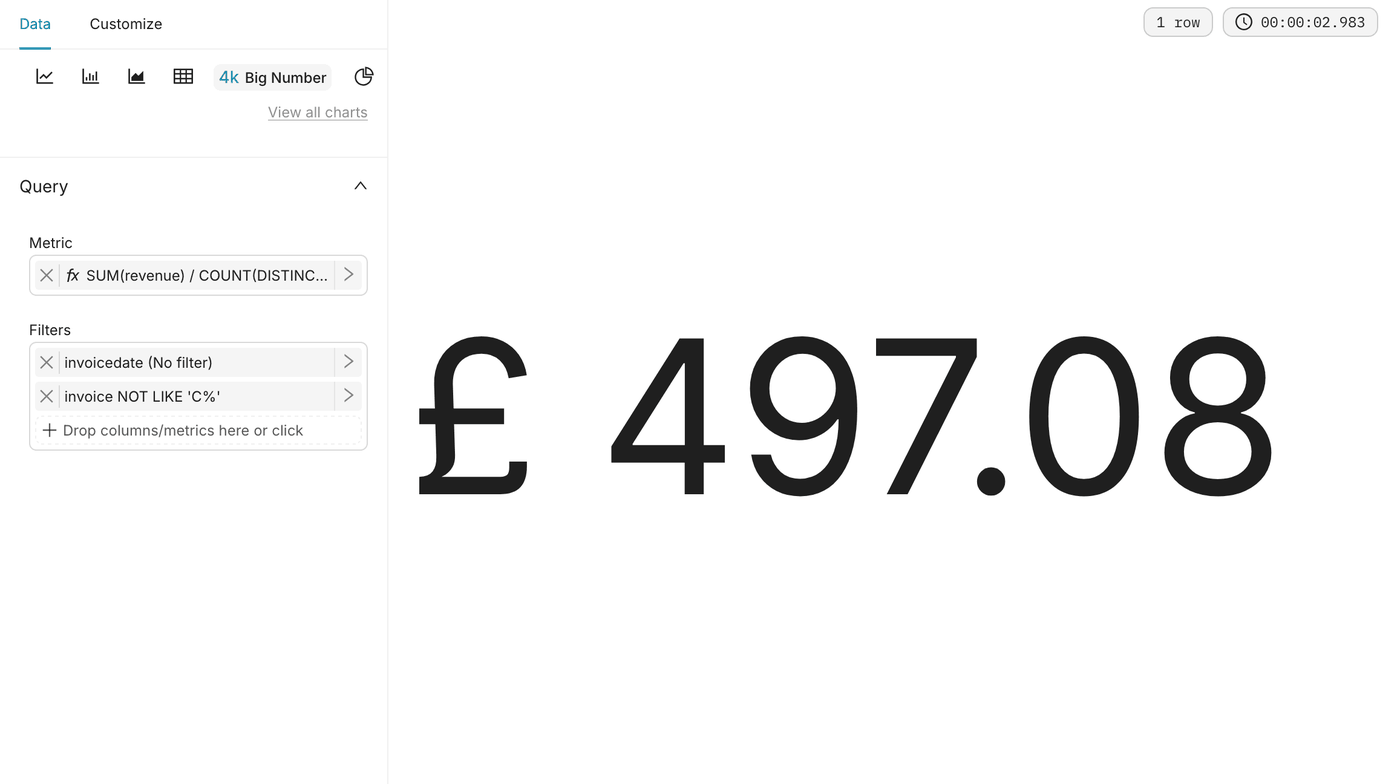
MetricCustom SQL: SUM(revenue) / COUNT(DISTINCT invoice)
FiltersCustom SQL: invoice NOT LIKE 'C%'
Number format,.2f
Currency formatGBP, prefix
Subheadersale invoices, before cancellations

Expected value: £497.08.

The Average order value Big Number chart with its Custom SQL metric and the sale invoice filter, showing £497.08
Warning

Do not use AVG(revenue) for the average order value. It returns the average amount of an order line, about £18.53, not of an order.

Customers

SettingValue
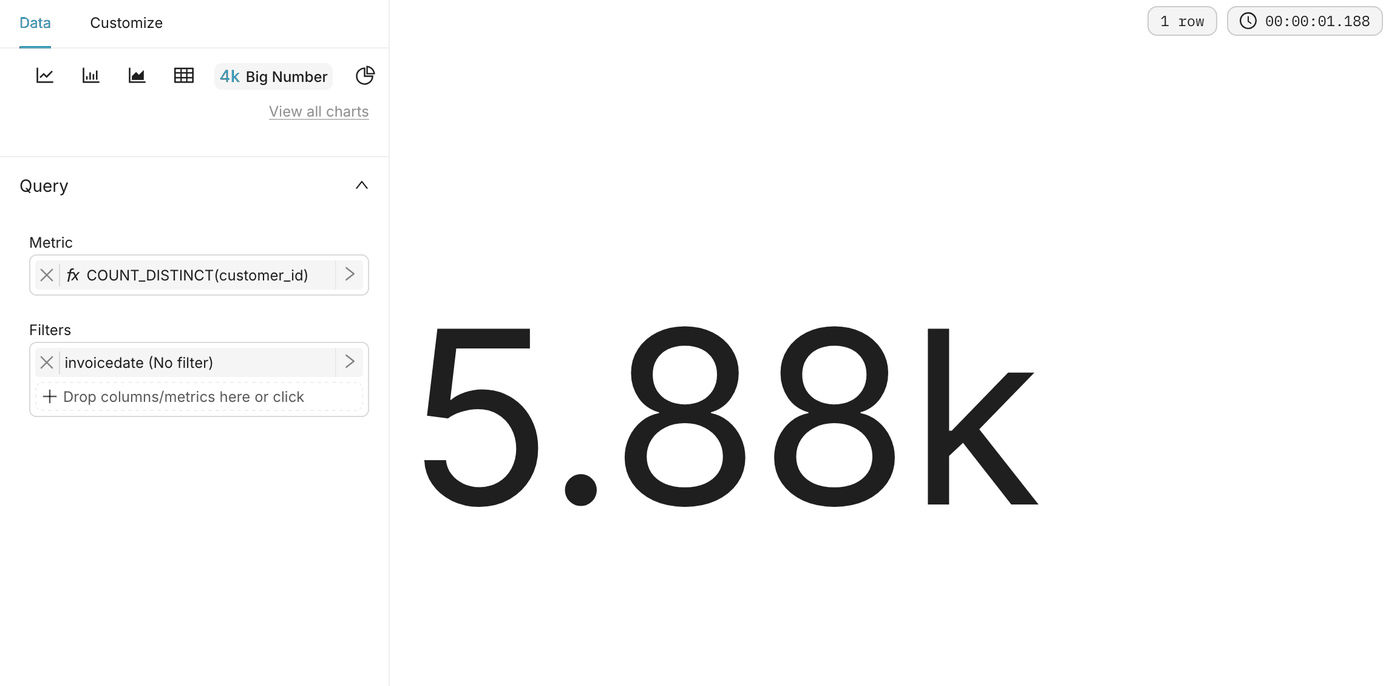
MetricSimple tab: column customer_id, aggregate COUNT_DISTINCT
Number formatSMART_NUMBER
Subheaderidentified customers

Expected value: 5.88k.

The Customers Big Number chart with the metric COUNT_DISTINCT(customer_id), showing 5.88k

Step 4: Build the Time tab

Net revenue by month
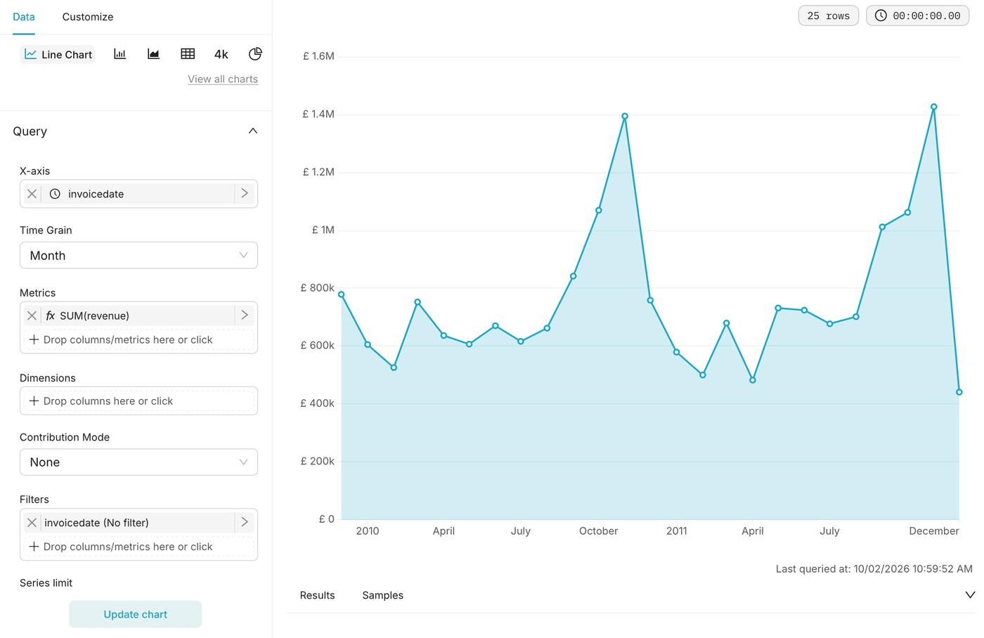
SettingValue
Datasetonline_retail_ii_clean
Chart typeLine Chart, or Area Chart
X-axisinvoicedate
Time grainMonth
MetricSUM(revenue)
Currency formatGBP, prefix
The Net revenue by month line chart from December 2009 to December 2011, with a peak each November

Seasonality by year

SettingValue
Datasetonline_retail_ii_clean
Chart typeArea Chart
X-axisCustom SQL: date_format(invoicedate, '%m - %M'), label month
DimensionsCustom SQL: CAST(year(invoicedate) AS VARCHAR), label YEAR
MetricSUM(revenue)
Currency formatGBP, prefix

You get one area per year. The month number at the start of each label keeps January to December in order.
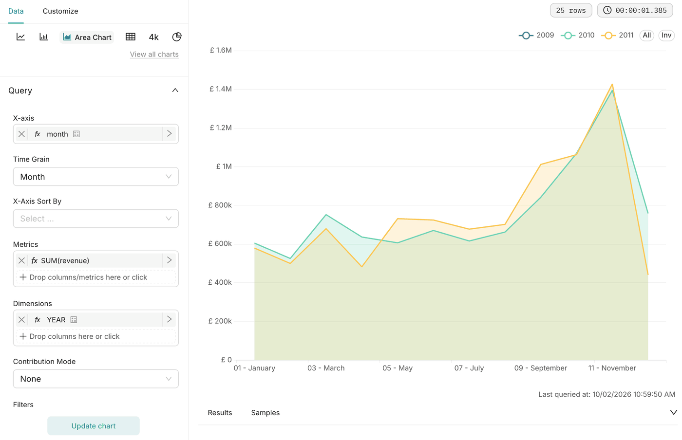
The Seasonality by year chart with one series per year, from January to December

Step 5: Build the Products tab

Both charts use the dataset online_retail_ii_clean and the chart type Table. The cleaning action gives each stock code a single description, so a product never appears twice.

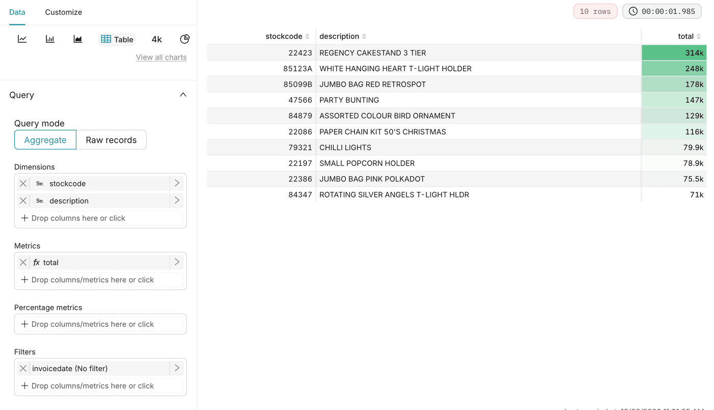
Top 10 products by revenue

SettingValue
Dimensionsstockcode, description
MetricsSUM(revenue), renamed total
Row limit10
Sort bytotal, descending

In the Customize tab, under Conditional formatting, add a rule:
SettingValue
Columntotal
Color schemesuccess
Color typebackground colour
Use gradientyes
The Top 10 products by revenue table, with a green gradient on the total column

Top 10 products by units sold

SettingValue
Dimensionsstockcode, description
MetricSUM(quantity), renamed quantity
Row limit10
Sort byquantity, descending

Apply the same conditional formatting as the previous table, on the quantity column. Placed side by side, the two tables show that the products sold in the largest volumes are not the ones that bring in the most revenue.
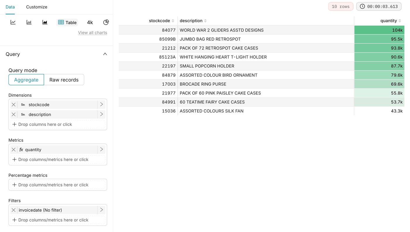
The Top 10 products by units sold table, with a green gradient on the quantity column

Step 6: Build the Geography tab

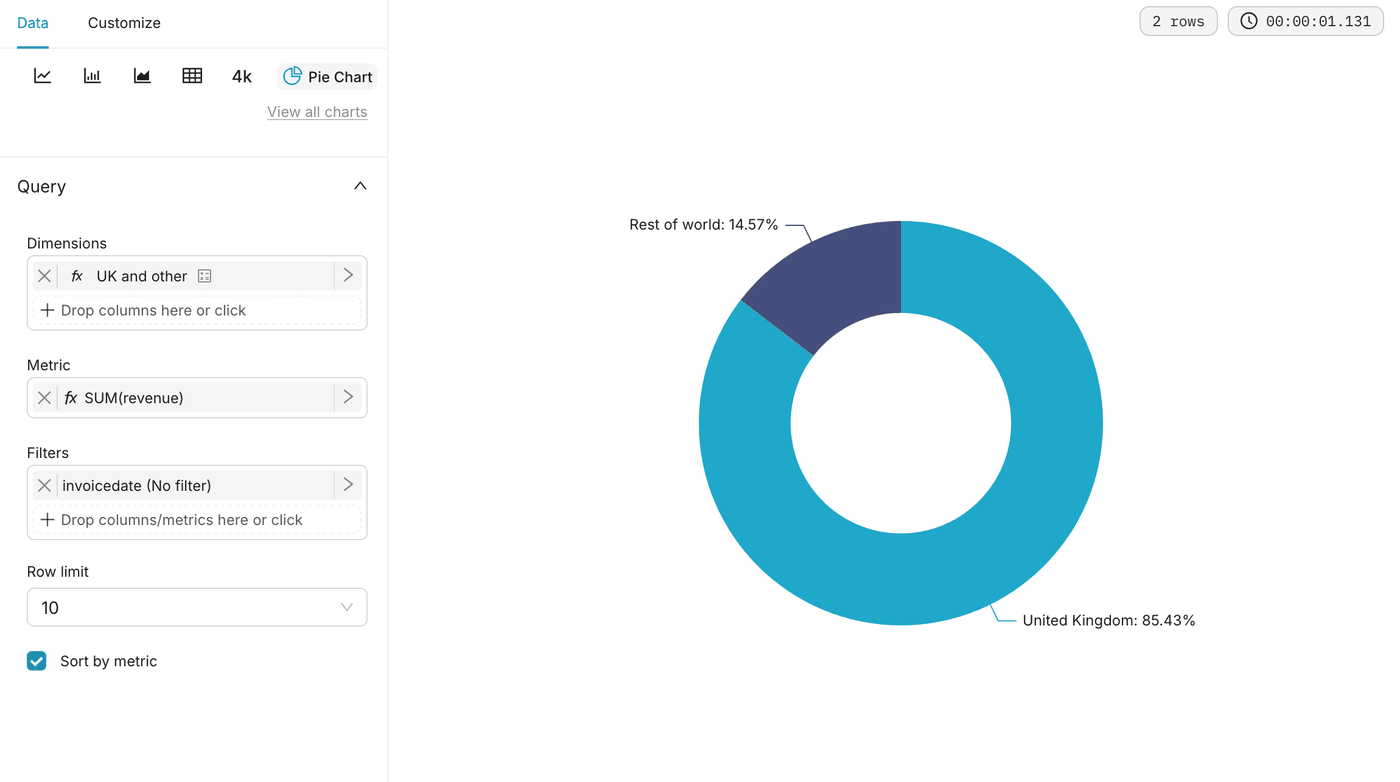
United Kingdom vs rest of world
SettingValue
Datasetonline_retail_ii_clean
Chart typePie Chart, with Donut enabled
DimensionsCustom SQL: CASE WHEN country = 'United Kingdom' THEN 'United Kingdom' ELSE 'Rest of world' END
MetricSUM(revenue)
Label typeCategory and Percentage
The United Kingdom vs rest of world donut chart, with the United Kingdom at 85.43% of revenue

Top 10 countries outside the United Kingdom
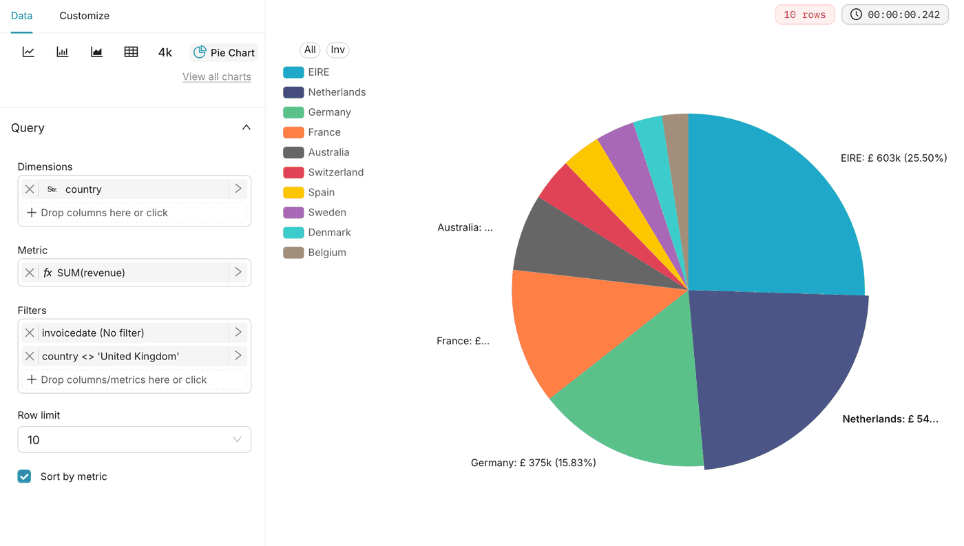
SettingValue
Datasetonline_retail_ii_clean
Chart typePie Chart
Dimensionscountry
MetricSUM(revenue)
FiltersCustom SQL: country <> 'United Kingdom'
Row limit10
Label typeCategory and Percentage
The Top 10 countries outside the United Kingdom pie chart, led by EIRE, the Netherlands and Germany

Revenue by country

SettingValue
Datasetonline_retail_ii_clean
Chart typeWorld Map
Country columncountry_code
Country field typeISO 3166-1 alpha-3 (cca3)
MetricSUM(revenue)
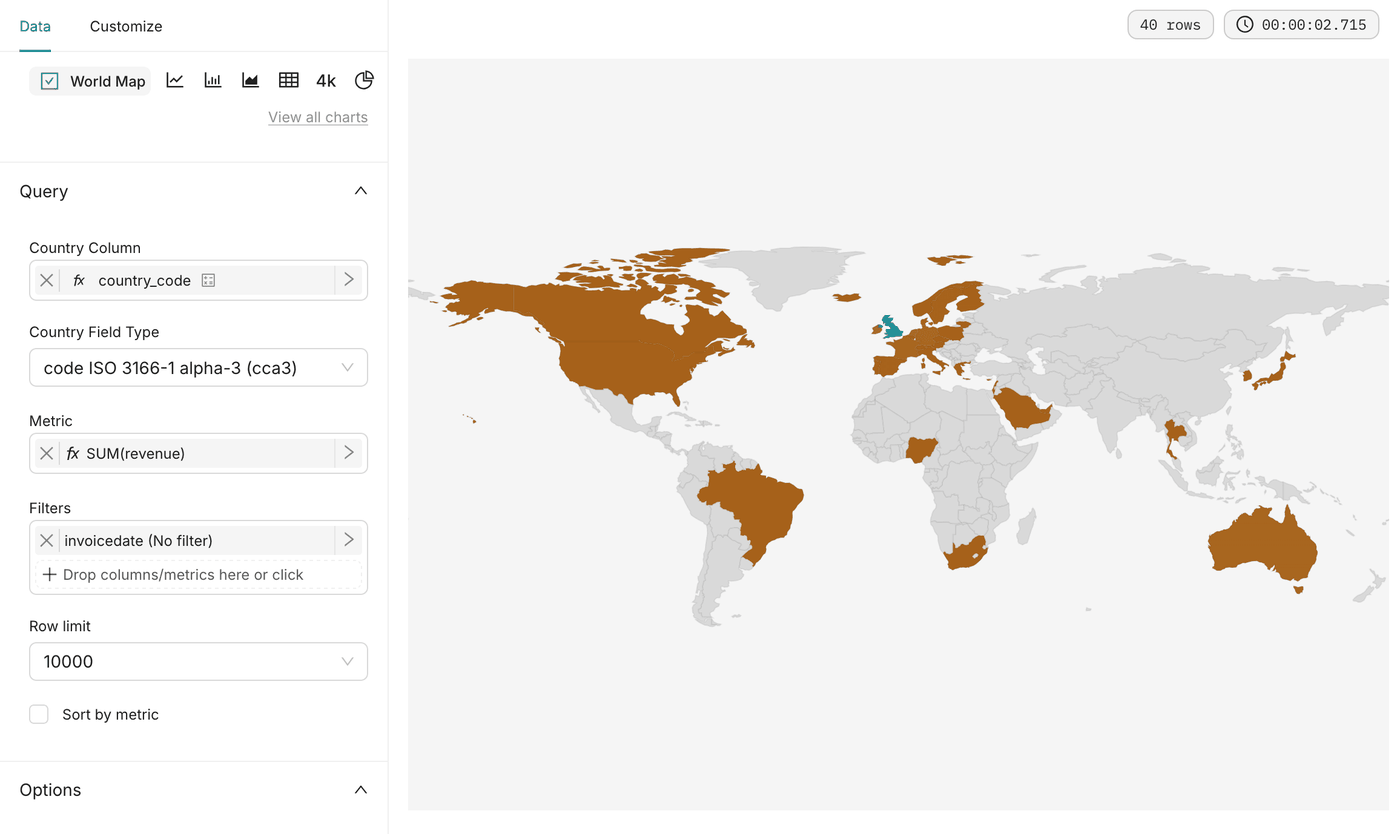
The Revenue by country world map with the countries of the store's customers coloured

Step 7: Build the Customers tab

These charts cover identified customers and sale invoices, from December 2009 to December 2011. Recency is measured from 9 December 2011, the last day of the data. A customer comes back when they buy on another day: several invoices on the same day count as one purchase.

Repeat customer rate

SettingValue
Datasetcustomer_summary
Chart typeBig Number
MetricCustom SQL: AVG(is_repeat)
Number format.1%
Subheadercustomers with two purchases or more

Expected value: 71.4%.

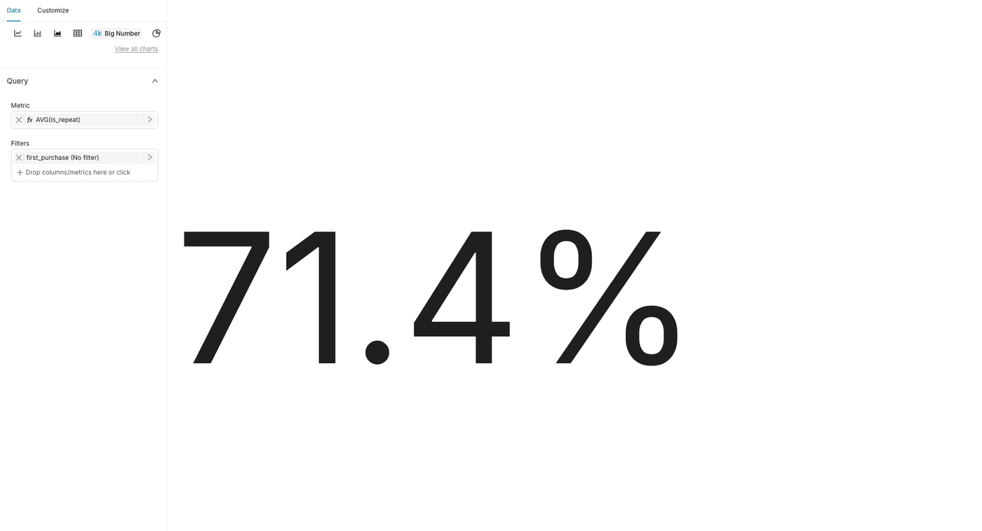
The Repeat customer rate Big Number chart with the metric AVG(is_repeat), showing 71.4%

Median purchases per customer

SettingValue
Datasetcustomer_summary
Chart typeBig Number
MetricCustom SQL: approx_percentile(purchase_days, 0.5)
Number format.0f
Subheaderpurchases per customer

Expected value: 3.
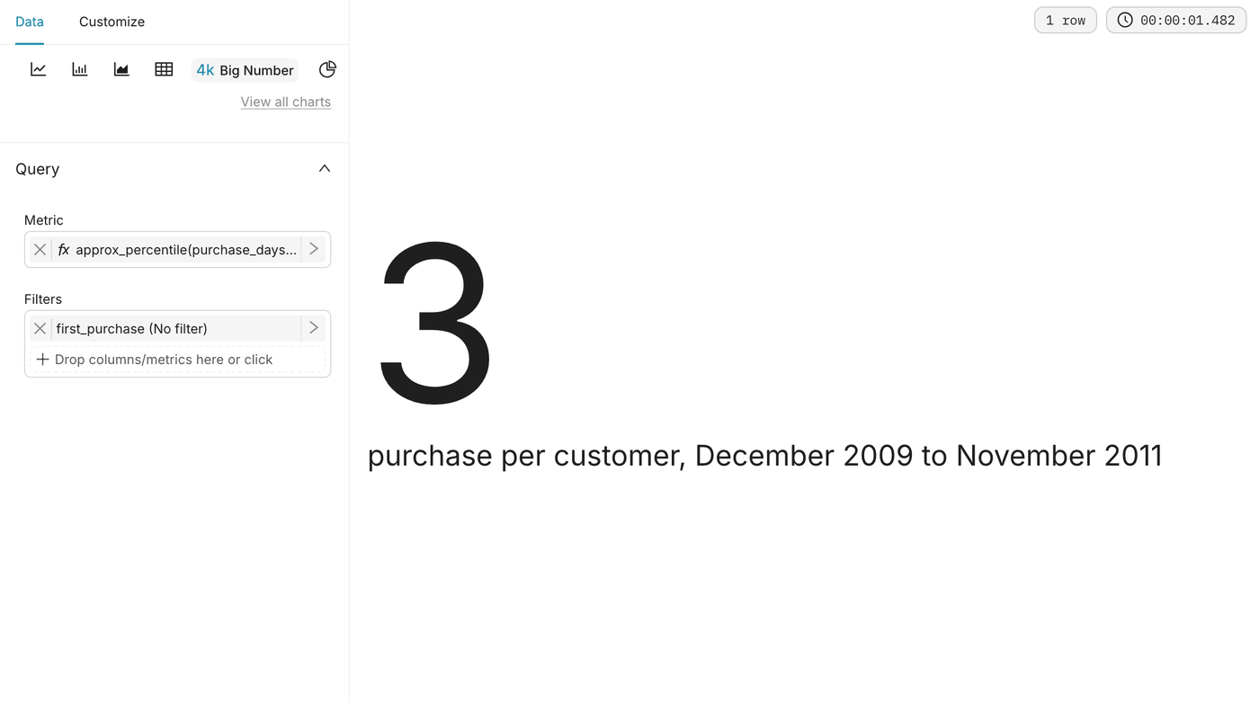
The Median purchases per customer Big Number chart, showing 3

Median days between purchases

SettingValue
Datasetpurchase_intervals
Chart typeBig Number
MetricCustom SQL: approx_percentile(days_since_previous_purchase, 0.5)
Number format.0f
Subheaderdays, across all return visits

Expected value: 32.

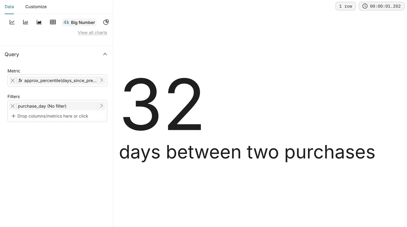
The Median days between purchases Big Number chart, showing 32

Customers by number of purchases

SettingValue
Datasetcustomer_summary
Chart typeBar Chart
X-axispurchase_days_capped
MetricCOUNT(*)
X-axis titlePurchases (10 = 10 or more)
Y-axis titleCustomers

If the bars are unevenly spaced, enable Force categorical on the X-axis.
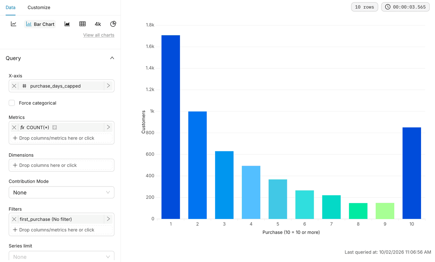
The Customers by number of purchases bar chart, from 1 to 10 purchases

Customers by recency

SettingValue
Datasetcustomer_summary
Chart typeBar Chart
X-axisrecency_segment
MetricCOUNT(*)

The four bars add up to 5,852 customers. The number at the start of each segment keeps them in order, from active to lost.
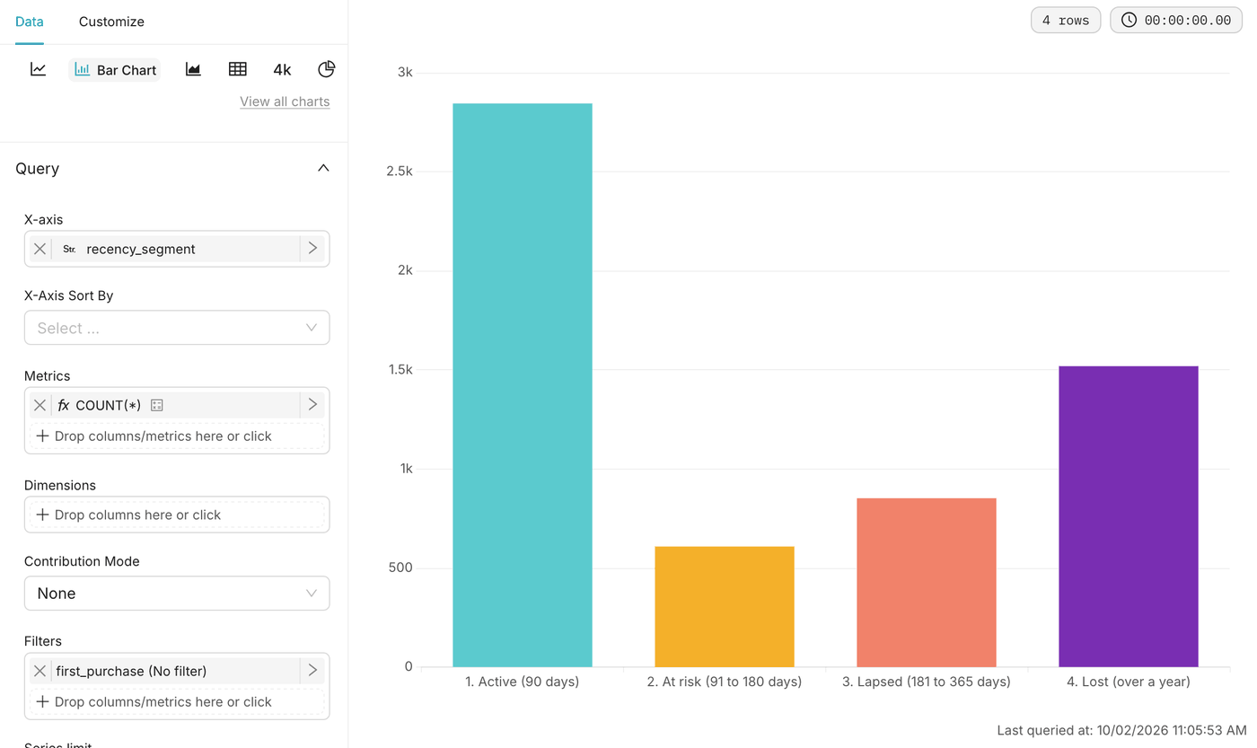
The Customers by recency bar chart with its four segments, from active to lost

Days between purchases

SettingValue
Datasetpurchase_intervals
Chart typeHistogram
Columndays_since_previous_purchase
FiltersCustom SQL: days_since_previous_purchase <= 365
Bins10
Normalizeenabled

The filter leaves out the rare returns after more than a year, which would stretch the axis and squeeze every other bar to the left.
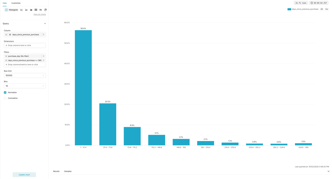
The Days between purchases histogram, normalised, with 10 bins up to 365 days

Step 8: Create and assemble the dashboard

  1. Open Dashboards and click + Dashboard. The new dashboard opens in edit mode.
  2. Click its title and rename it Online store sales.
  3. Add a header Key figures, drag the 4 key figure tiles from the right panel and place them on one row.
  4. Add a header Trends and breakdowns, then a tabs component with 4 tabs: Customers, Time, Products and Geography.
  5. Drag each of the other charts from the right panel into its tab. In the Customers tab, put the 3 tiles on one row, the 2 bar charts side by side and the histogram at full width.
  6. Click Save.

What you have built

You have a dashboard that answers the questions of an online store manager: how much the store sells and to how many customers, how sales evolve over the year, which products and countries matter, and how often customers come back.

From here you can add dashboard filters on country or on a date range, or apply the same pipeline to your own order data. For another Superset dashboard built on Data Platform, see the FOCUS and Apache Superset use case.

Go further

For training or technical assistance implementing our solutions, contact your sales representative or visit our Professional Services page to request a quote and have your project analysed by our experts.

Ask questions, give your feedback and interact directly with the team building the Data Platform on the dedicated Discord channel.

If you need support with your OVHcloud services, create a request in our Help Centre.

Join our community of users.

Was this page helpful?